
Sometimes I get asked, “How do you work? How did you create that?” Basically, they’re wanting to know what my process is like.
It’s a relatively simple answer with a lot of underlying layers. Every project is different; but first and foremost, you design for the content. The content drives the design—not the other way around. So most of what I do is predicated by the content given to me, as well as, customer and business objectives and goals. However, for simplicity sake, my larger, overall process looks like this:
• Discover research, education, information
• Define strategy, concept, planning
• Design aesthetics, form, interface
• Develop coding, editing, production
• Deliver publish, go live, print
• Define strategy, concept, planning
• Design aesthetics, form, interface
• Develop coding, editing, production
• Deliver publish, go live, print
Design is a continual process of refinement. Throughout the process, you’re always (re)evaluating everything that you do, and why you did it. Besides striving to achieve that perfect harmony between aesthetics, content, objectives and goals, ultimately, you’re asking yourself: “What does it do for the brand and user experience?”
Sometimes you have to repeat steps. The scale or degree to which each one of the phases happens will vary from project to project. But the process is the same for everything, whether it's designing a billboard ad or a B2B mobile app.
“Wait a second. User experience, you say—even for print?!?”
Yes! The term user experience seems to be one of those buzzwords thrown around a lot these days with anything involving interactive media. However, user experience unequivocally is the guiding light in ALL design—whether it’s interaction, graphic, interior, industrial, fashion, video game… or even wedding cakes. In business, for the end product, all roads fundamentally lead to brand and user experience. I’ll touch on user experience a little more as you read on.
With that said, I’ve pulled three projects from my portfolio to show an overview of my process. There’s one from each of my core areas of focus: Interaction (UX/UI) design, Creative Marketing (marcom) design, and Presentation (keynote) design.
Keep in mind that these are very streamlined, higher-level snapshots of each project and the process behind each one. It’d be extremely tough and lengthy to document and visualize all of the numerous files and countless intermediate steps taken. And things such as notes and sketches on paper, whiteboard, or anything else not on the computer screen aren’t shown. I typically don’t hang on to that stuff after I finish the project.
Enjoy!
Note: Pressed for time right now? You can always scroll down to each image, which visually summarizes the story behind each project.
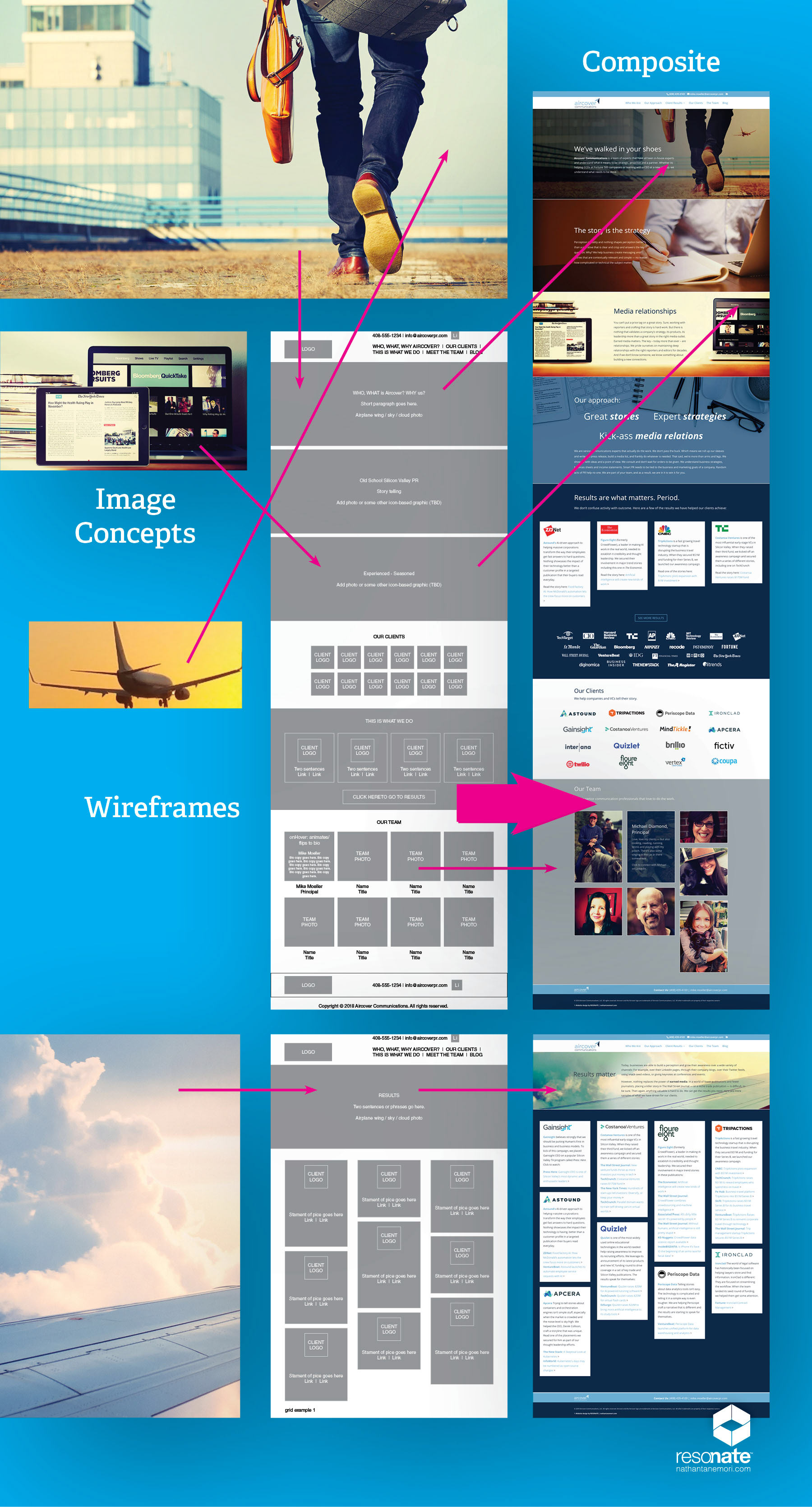
Aircover Communications website
In today’s world, it seems like every business needs some type or level of online presence—and then a designer (like myself) to create it. For example, that could be in the form of a website, a mobile app, or just a social media page. Regardless of what you end up choosing, understanding usability is paramount. As stated earlier, all roads lead to user experience (and brand) in design. In the case of interaction design, we don’t want to sacrifice usability for beauty or other pertinent issues that can kill the user experience, such as, load times, navigation, clutter, visibility, or site structure.
Although we always want things to “look good,” aesthetics becomes secondary. The late 19th-century modernist principle of Form Follows Function still very much applies today. You can have the most beautiful and visually compelling product. However, if usability is poor, the product will suffer, and turn off the consumer or user. Keeping things simple and intuitive are key components of good user experience. So part of my job is to guide the planning so that we are continually designing for function and communication—while trying not to overly complicate things.
So now, once the planning (e.g., messaging, content, strategy) is established, there is always some preliminary sketching and drafting on paper and/or whiteboard. We’re visualizing the pages and the flow. Often diagramming software like Visio or Draw.io is used for a final render of the sitemap.
The Blueprint
Based on the sitemap, wireframes are created in an application, such as InDesign or XD, to visualize the architecture of the website. There are no cosmetics such as the actual colors, fonts or images in wireframes. They only show skeletal structure and functionality, and how it pertains to content. Basically, wireframes to a designer are like the blueprints to an architect.
Based on the sitemap, wireframes are created in an application, such as InDesign or XD, to visualize the architecture of the website. There are no cosmetics such as the actual colors, fonts or images in wireframes. They only show skeletal structure and functionality, and how it pertains to content. Basically, wireframes to a designer are like the blueprints to an architect.
After the wireframes are created, a lot goes into sourcing the right imagery. We’re looking for a cohesive style and point of view that speaks to the brand. In this case, there was also some post-production Photoshop retouch and styling work to pull off.
The Simulation
The next phase might include a prototyping tool such as XD or Sketch to test the preliminary designs, sequences and functionality against actual device platforms. These steps allow us to simulate the product interaction and user experience before investing any time and efforts into the actual build.
The next phase might include a prototyping tool such as XD or Sketch to test the preliminary designs, sequences and functionality against actual device platforms. These steps allow us to simulate the product interaction and user experience before investing any time and efforts into the actual build.
We then begin to create a mockup with the content. If all of the content isn’t ready, then I just use placeholders. I will create the key pages in Photoshop or Illustrator. This way the client can see what my vision, design and specs look like. If I’m working with a dev team, then I’ll hand off the layered PSD or AI files to them to reference and build out.
Depending on the size and complexity of the site, as well as the needs and time constraints of the client, I might skip the prototyping and page comps. Then I would go straight to the construction and begin to create the pages. I already have the creative vision in my head or in a brief and know what is needed. Having at least the wireframes allow us to have a reference point while we build the framework of the site. The visuals and UI design are created based on my art and design direction as the site comes together.
The Construction
In Aircover’s case, we’re using WordPress tools to build their website. WP currently seems to be a viable solution for most of my clients’ needs. It’s a modern, open source platform, and we won't have to worry as much about the site being responsive for mobile.
In Aircover’s case, we’re using WordPress tools to build their website. WP currently seems to be a viable solution for most of my clients’ needs. It’s a modern, open source platform, and we won't have to worry as much about the site being responsive for mobile.
On more complex websites such as database driven sites, I have developers on my team. Their preference might be a text editor to hand code all of the pages. The extent of my coding skill is limited to basic HTML/CSS (and a bit of PHP.) I’m strictly a visual designer and I specialize on the front end. Anything more than that, I have to use a web development tool (WP or Dreamweaver) and/or a web developer to handle the backend.
Now I start with the foundations of any site, such as the CSS, header, footer, menu. Once the static and template pages are created, then we add in the rest of the functionality and any dynamic content. Finally, the refining details are looked at once again, such as spacing, alignment, as well as the parallax and actionables’ speed and timing. We want to clean and tighten things up for a final review and QA.
The Timeline
Once I have the client’s approval, we publish and go live. Depending on the size and complexity of the site, as well as the client’s responsiveness, a smaller website can take maybe a month or two to finish. Some of the larger scale sites have taken me several months to even a year.
Once I have the client’s approval, we publish and go live. Depending on the size and complexity of the site, as well as the client’s responsiveness, a smaller website can take maybe a month or two to finish. Some of the larger scale sites have taken me several months to even a year.
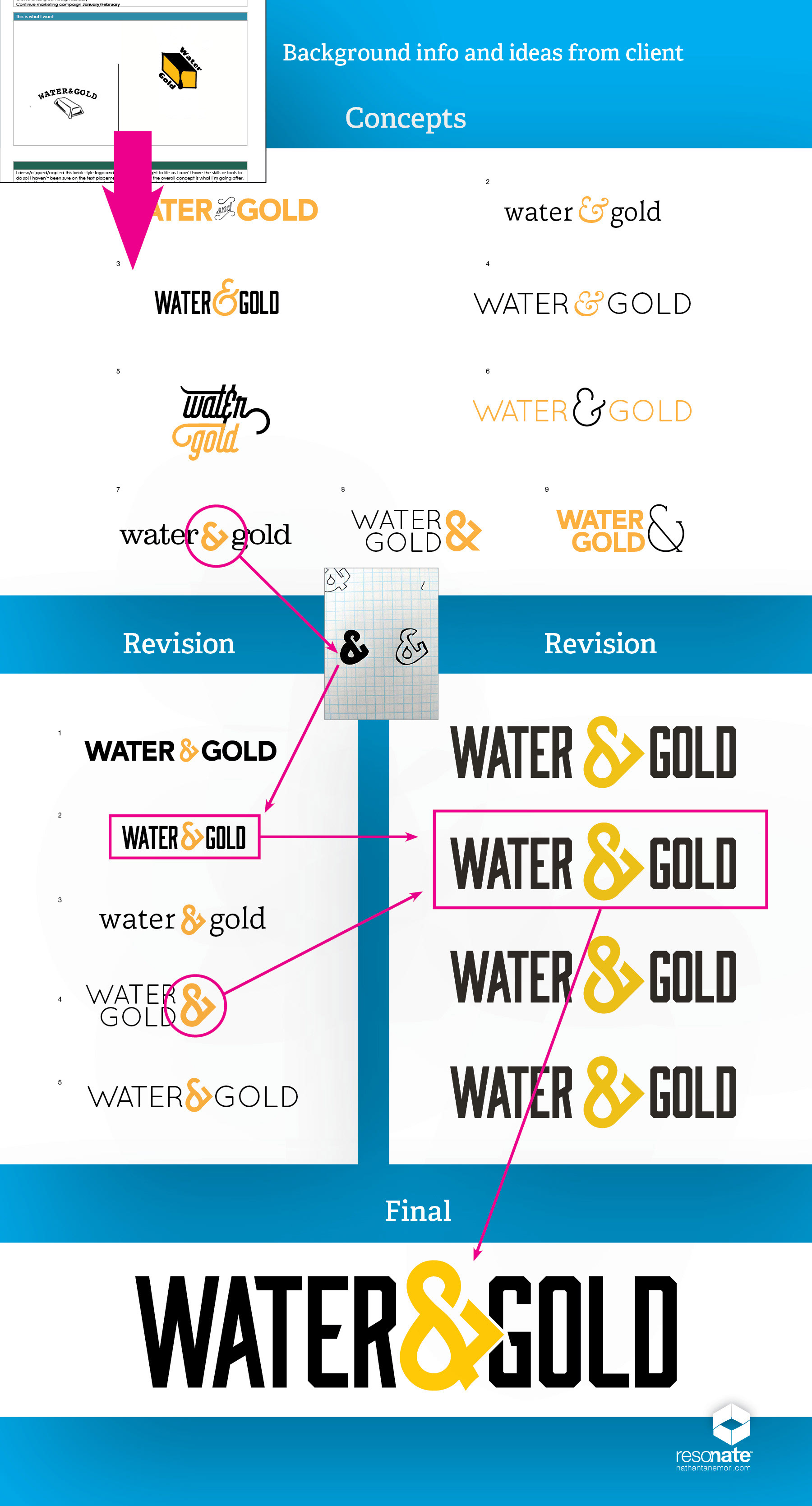
Water&Gold logotype
I was provided a docket to design the new corporate logo for Water&Gold. I always want to listen first to what the client has to say, and see their ideas, as well. Invariably, my goal is to satisfy the client’s wishes, and provide the best value and ROI in what I do. However, as a professional, I am paid to evaluate the problem, come up with the optimal working solution based on the parameters and constraints of the project, and bring in my own point of view (or ideas and interpretations.)
The client’s ideas are shown below. Ultimately, the collaboration and strategy led us towards a logotype, instead of going with more of a traditional logo, as they had originally envisioned. In Water&Gold’s case, a logotype will be far more versatile in voice and across various brand applications as they build out the company.
The Exploration
Like most things, creating a logo or corporate identity usually begins from sketching on paper. These might be rough, quick drawings that get my ideas flowing and imprinted on something tangible, and not on the computer screen.
Like most things, creating a logo or corporate identity usually begins from sketching on paper. These might be rough, quick drawings that get my ideas flowing and imprinted on something tangible, and not on the computer screen.
Although, I must confess, over the years I’ve learned to use the computer a lot more as a drawing tool. There’s nothing like ⌘+C/⌘+V and multiple ⌘+Z’s. But there’s still something to be said about hand drawing on a piece of paper and viewing it off-screen that still resonates with me.
Next I translate the sketches I like onto the computer using Illustrator. And the tweaks and refinements continue on the computer. Once I identify a group that I like, the concepts and potential designs, color palette, and typeface selection are eventually presented to the client.
The Refinements
Now the client provides feedback on what they like, what they don't like. What’s working, what’s not working for them. But more importantly, I want to know why. Just saying you don’t—or do—like something, without articulating your reasons, doesn’t really help me to understand, and to advance the process. Otherwise, it just becomes an exercise in “throwing sh*t against the wall, and seeing what sticks.” And that’s not always the smartest approach.
Now the client provides feedback on what they like, what they don't like. What’s working, what’s not working for them. But more importantly, I want to know why. Just saying you don’t—or do—like something, without articulating your reasons, doesn’t really help me to understand, and to advance the process. Otherwise, it just becomes an exercise in “throwing sh*t against the wall, and seeing what sticks.” And that’s not always the smartest approach.
Afterwards, l come back with another round and revisions based on their feedback. We basically continue this process of refinement until the final logo is completed.
Once approved, I create the logos in the necessary color and file formats. I choose to create all my logos in vector because I want them to be in a resolution-independent format. This way you can scale the logos to any size without loss of quality—sorry, Photoshop, but this is where Illustrator is far more flexible and superior.
The Timeline
The Water&Gold logotype took maybe a week and a half to design. Depending on the client’s responsiveness, I’ve had some identity design projects take a month or longer to develop.
The Water&Gold logotype took maybe a week and a half to design. Depending on the client’s responsiveness, I’ve had some identity design projects take a month or longer to develop.
Click here to view the full gallery, and to learn more about The Opportunity and Partnership with Water&Gold.
Credo Higher Education presentation
When it comes to presentations, I believe that more than any other medium, people feel the most empowered to unleash their “inner designer” within. Although, creating their own logo might take the cake—see above. After all, it’s their baby and they’re the ones presenting it.
PowerPoint seems to be what most of my clients prefer to use these days. I think in part, because it often comes free with Windows. But the software is intuitive enough that most people can figure out the basics to create some really… eh hem… poorly crafted presentations, much to their chagrin. I mean, who can resist all of those fonts, and preset shapes, SmartArt and styles at their disposal?
Whereas, others haven’t a clue on how to use PowerPoint other than building an entire wall of text. And wait, now you want me to add in some graphics as well to the slide—somewhere, somehow?!
The Approach
Again, the content drives the design. So when I get a presentation, each deck and slide within is often its own experience. And each may require a different strategy. But to varying degrees, it seems that each slide or deck usually falls into one of two categories:
Again, the content drives the design. So when I get a presentation, each deck and slide within is often its own experience. And each may require a different strategy. But to varying degrees, it seems that each slide or deck usually falls into one of two categories:
1. The core concept, message and imagery are there. I just need to make it all look better.
2. The fundamental concept or message is there. I just need to visually convey that.
2. The fundamental concept or message is there. I just need to visually convey that.
And then the all-encompassing challenge is how to make the entire deck look and feel cohesive, and unified in design aesthetic and flow—all while aligning with the company’s brand. All of this is part of what makes presentation design such a challenge and a unique beast on its own.
The Vision
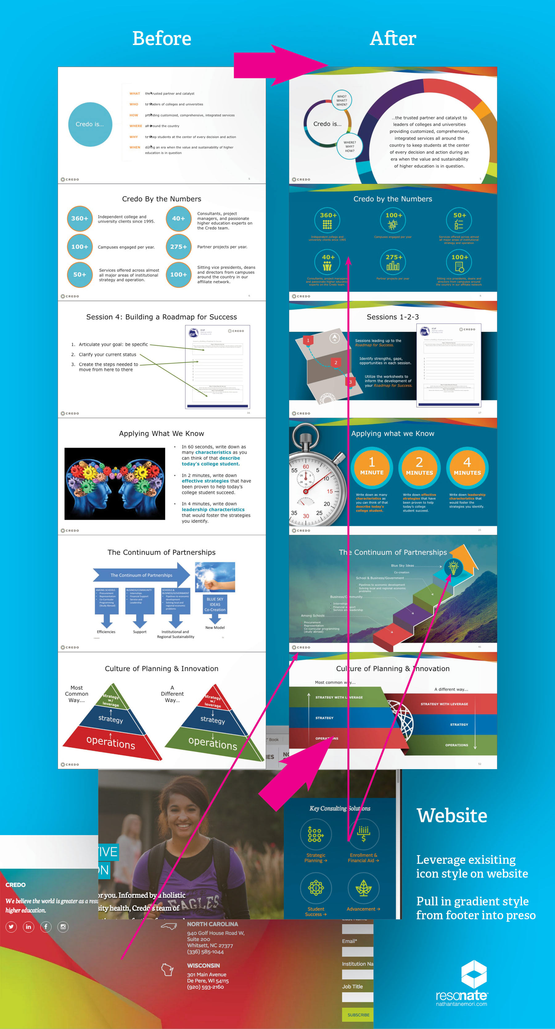
So before I begin to dive into Credo’s presentation, I first peruse some of their key brand assets, such as their website and collateral, to get a familiarity of the company’s voice and vision, as well as to get a sense of their overriding design aesthetic.
So before I begin to dive into Credo’s presentation, I first peruse some of their key brand assets, such as their website and collateral, to get a familiarity of the company’s voice and vision, as well as to get a sense of their overriding design aesthetic.
Now once in the presentation, I begin with evaluating the master template and design direction. From what I gather, a couple of the things I want to leverage are the gradient texture in the website footer and the infographic and icon style on the home page.
After all, it’s about cross-media and brand integration. We always want to be thinking globally and holistically. I don’t have to “recreate the wheel” if I see that they already have a working solution elsewhere. It’s my job to find the strongest touch points of their brand and leverage them since time is also a factor. We don’t have the time or budget to recreate everything across the deck.
Once the Credo master elements and design system evolves to a point that’s going to work, I begin to tackle each slide one at a time. And now the fun really begins…
The POU
I think most designers hate using PowerPoint largely in part because it doesn’t function like, or it isn’t as refined like, Adobe Illustrator or InDesign. PowerPoint is extremely rudimentary and obtuse relative to Adobe products, or even Apple Keynote. But that doesn’t mean you can’t create engaging and effective slides. You just have to be adaptable and learn to work within its—or any tool’s—parameters and limitations.
I think most designers hate using PowerPoint largely in part because it doesn’t function like, or it isn’t as refined like, Adobe Illustrator or InDesign. PowerPoint is extremely rudimentary and obtuse relative to Adobe products, or even Apple Keynote. But that doesn’t mean you can’t create engaging and effective slides. You just have to be adaptable and learn to work within its—or any tool’s—parameters and limitations.
As a designer, what’s more important than knowing how to use PowerPoint, is knowing how to envision information. You need to be able to extract what the core message or concept is, and then visually interpret that in a simple and uncomplicated way. So whether you're drawing with some sophisticated graphics software, or drawing with a stick in the sand, if you can streamline your thoughts and form across each slide in the deck, then it becomes easier for the audience to follow. Again, all of this points back to what I said earlier about user experience is everything.
Probably the biggest, overarching mistake in the art of presenting seems to be the unawareness that people can’t effectively understand multiple, concurrent streams of information. This means that the viewers can’t simultaneously comprehend what the presenter is saying, while reading what’s on the slide. The heavier the text/copy or detailed the slide is, the less likely the presenter will be heard, or vice versa.
Try it yourself. Try focusing on reading some type of article—like you’re doing now—AND fully listening to someone speak to you at the same time. You can’t. It’s pretty much one or the other. You can’t effectively do both 100%. So you have to ask yourself where you want the center of attention to be—on the presenter or on the slide?
This will vary from slide to slide, but I’d think, by default, the primary focus should be on the person speaking. However, the presenter’s job isn’t to just simply read off lines of text that’s already being shown on screen. After all, the audience knows how to read, as well. The slide should only be there to visually support the presenter by highlighting the essence of the message or concept in a way that actually doesn’t require a lot of reading. This way the viewers can take a few seconds to scan the slide, and then focus back on what the presenter is saying.
So a key to creating an effective presentation is to simplify, simplify, simplify. This might mean removing all of that heavy on-screen text that no one past the fourth row can read anyways off of a projector, and moving it to speaking points. Instead, perhaps a simple image or visual metaphor with a keyword that summarizes the concept is more appropriate. After all, “a picture is worth a thousand words.” Or, it might mean splitting the slide into multiple slides to break things up, so that only one concept or topic at a time is being shown and discussed—rather than too many all crammed into one slide. Or, instead of displaying your typical chart, how can we visualize the chart data in a way that takes more of an engaging, storytelling approach? This is why infographics have become so popular these days.
Animation and builds can be a great asset within a presentation, too. After all, it’s just another tool within the toolbox, like anything else. But they can become gimmicky and get overused a lot. They actually end up being more of a distraction—as well as, be very time consuming on both ends. However, with the right technique, having a bit of motion and actionables in the deck can break up monotony, help focus in on one thing at a time, or be an added dimension or layer when trying to visualize more complex concepts. But mostly, they’re best used sparingly.
Ultimately, it’s about striving for a better transference of information and providing a better viewing (or user) experience for the audience. This in turn, hopefully helps to yield the level of ROI the company is wanting from their conference or event.
The Timeline
The amount of time I get to work on a deck varies. But it seems like the lion’s share of time is always consumed on the front end—or the messaging, authoring the talk track, drafts from all of the contributors and editors. So the amount of time left for design on the backend is usually very minimal. For the typical 10-20 slide presentation, I might have anywhere from a handful of hours to a handful of days to do my job. Although you have to be able to work quickly and efficiently without consistently sacrificing a high-level of attention to detail, there is a process to design. And good design takes time to develop. So the more time allocated for design—to any project, not just presentations—the better.
The amount of time I get to work on a deck varies. But it seems like the lion’s share of time is always consumed on the front end—or the messaging, authoring the talk track, drafts from all of the contributors and editors. So the amount of time left for design on the backend is usually very minimal. For the typical 10-20 slide presentation, I might have anywhere from a handful of hours to a handful of days to do my job. Although you have to be able to work quickly and efficiently without consistently sacrificing a high-level of attention to detail, there is a process to design. And good design takes time to develop. So the more time allocated for design—to any project, not just presentations—the better.
This project took under three weeks. Due to budget constraints, I was only able to get through about 90 slides (70%) in the master deck. It was actually quite an accelerated turn around time for the amount of work 130+ slides is to overhaul. They will have to use what I created as a basis to redesign the remaining slides on their own. Part of the original objective was to create a visual design system from which they could work to create new slide content themselves.
Click here to view the full gallery, and to learn more about The Opportunity and Partnership with Credo Higher Education.
I hope seeing an overview of my process gives you a glimpse into how I work and think. If you have any available design opportunities, feel free to contact me. I'd love to discuss it with you!