The Opportunity
As a startup urban clothing and footwear company with no brand identity, Water&Gold is the newcomer to an already saturated market. So how does an entrepreneur with a vision build a brand? For that, he turned to me to further refine and establish the creative and brand direction.
As a startup urban clothing and footwear company with no brand identity, Water&Gold is the newcomer to an already saturated market. So how does an entrepreneur with a vision build a brand? For that, he turned to me to further refine and establish the creative and brand direction.
The Services
Creative, brand and content strategy
Art direction
Design: Brand guidelines, photography direction, logotype
Design (not shown): B2C website (temporary), email capture system
Tools: Photoshop, Illustrator, InDesign, Acrobat, WordPress, MailChimp
Creative, brand and content strategy
Art direction
Design: Brand guidelines, photography direction, logotype
Design (not shown): B2C website (temporary), email capture system
Tools: Photoshop, Illustrator, InDesign, Acrobat, WordPress, MailChimp

The Partnership
This was my second time working with the founder who is trying to launch his second brand after a unsuccessful attempt on his initial product offering. So much of his passion and vision hasn’t wavered, and there was some familiarity with Water&Gold that allowed me to take the ball and run with it.
This was my second time working with the founder who is trying to launch his second brand after a unsuccessful attempt on his initial product offering. So much of his passion and vision hasn’t wavered, and there was some familiarity with Water&Gold that allowed me to take the ball and run with it.
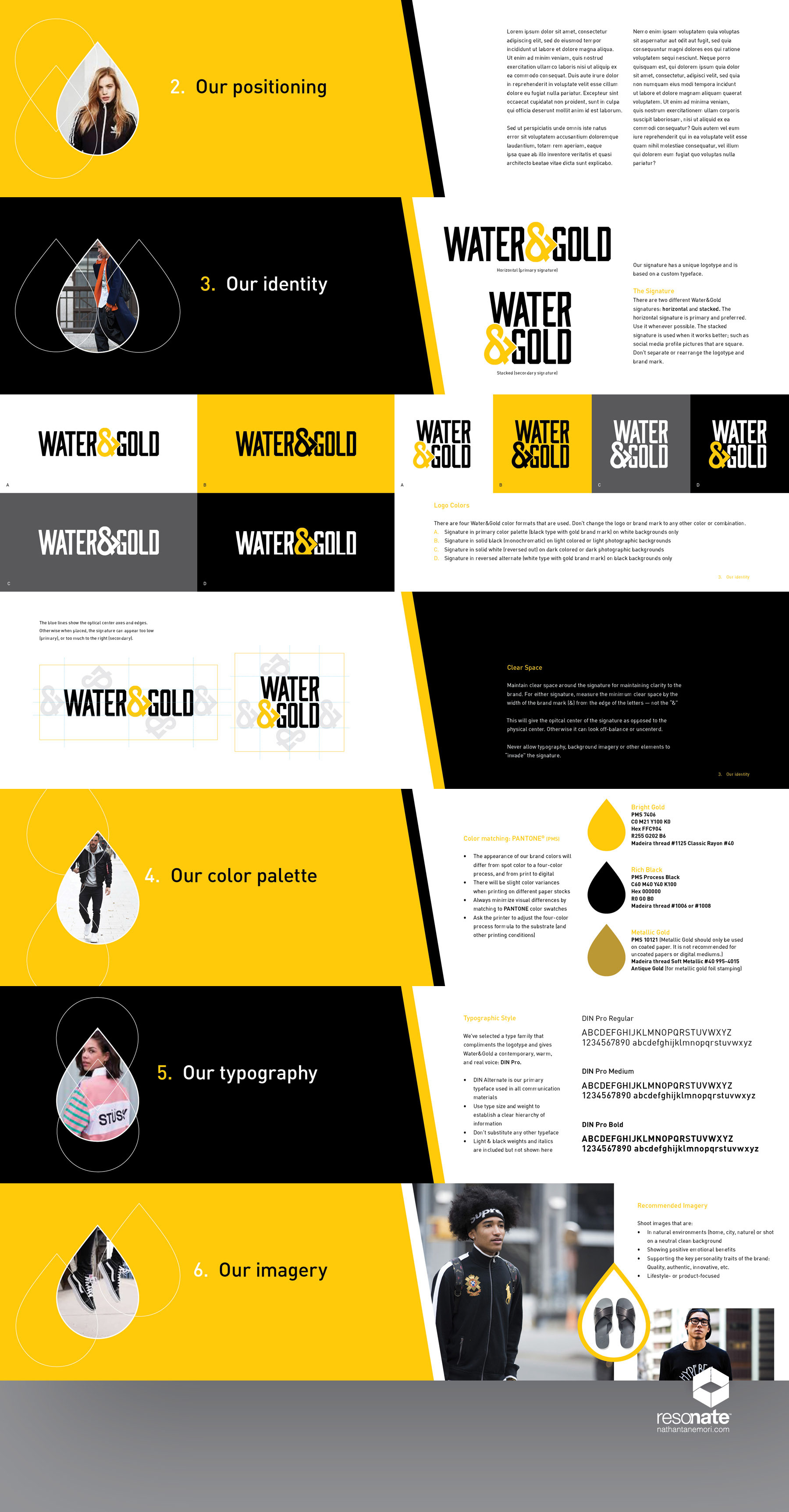
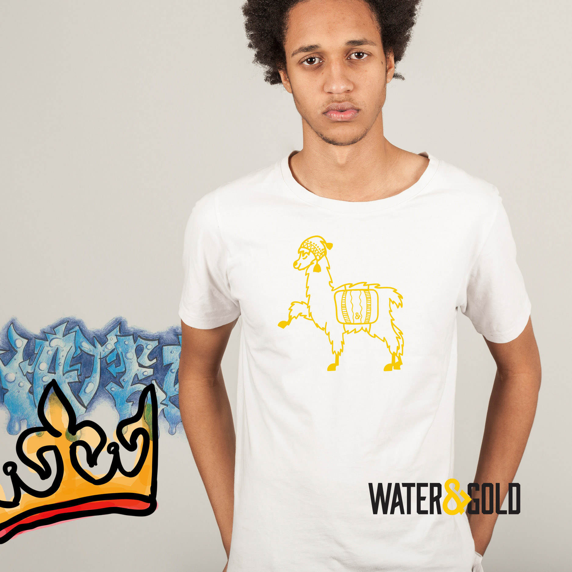
The logo is part of the foundation for any brand, so we started there. The ampersand in the logotype is the mark, which is also part of the name. The water drop inside is complemented by the rigid lettering that evokes strength and quality towards young adult demographic.
Two formats of the logotype were created: Primary (horizontal) and alternate (square) for when space is an issue or for social media since they're all 1:1 aspect ratios.
While the prototypes are being produced, the next part of this phase was to create a basic brand guidelines book that sets the tone as the founder builds his company and product line.
Photography is key in any retail clothing and footwear space. The creative direction for photography shows capturing the lifestyle on the streets or on model with lighting that sets the correct mood.
The Result
The feedback on the logo is being well received. And as the company follows the course, it remains to be seen what will happen. But he should feel good that what we've created it will form a solid base for phase one.
The feedback on the logo is being well received. And as the company follows the course, it remains to be seen what will happen. But he should feel good that what we've created it will form a solid base for phase one.
Click here to read more in-depth about my process behind creating Water&Gold’s logotype.